Building a Design System for an Existing Product for Consistency and Efficiency

Our design team at CVS Health focuses on designing Compass, the internal patient-prescription management system, surrounding a Salesforce implementation to help pharmacy care representatives manage patients’ information more efficiently.
CRM Platform Shift
CVS previously uses PeopleSafe as their CRM system. For better user experience and to take on the increasing functionalities, we are shifting our CRM host to Salesforce.
Design Tool Transition
The design team is transitioning from Axure to Figma as the choice of design tool. The existing Compass functionalities are mostly designed in Axure. The team is looking to have a seamless transition to the new design tool.
My Role
Starting my job as a UX Designer at CVS, I immediately noticed the amount of inconsistency across the existing designs due to the lack of an mature design system, especially with typography, color, layout, and the use of components. As the designer in charge of the Figma transition, I led the building of a design system to increase consistency and design flow efficiency, and to improve the communication between the design and development teams.

Sige Zheng
UX Designer
Responsibilities: Led the Design System Creation; Communication with Development, Design, and business teams
Duration: 1 Month
Design Tools: Figma , Axure, Salesforce, PeopleSafe, Rally
Platform: Web App
98% of Users don’t Convert
The high abandon rate during the browsing stage and low purchase rate at the check out stage of e-commerce result in low revenue.
Lack of Trust and Confirmation
With too many options and limited professionally verified information, users feel indecisive about the choices they make in every stage of the shopping experience, thus they delay or abandon the purchase.
Familiarity Helps Users Make Decisions Quicker
The deliverable product leads users to a familiar path and helps them make decisions with visual intuition by integrating their shopping journey with the phone camera. Users can then make choices quickly, which leads to higher conversion rate.

Sige Zheng
UX/UI Designer
Responsibilities: Research, User Flow, Interaction Design, Branding, Sketching, Prototyping & Testing
Design Tools: Miro, Figma, InVision, Marvel, Google Suite
Duration: 5 Weeks
Approach: Lean

Sige Zheng
UX/UI Designer
Responsibilities: Research, User Flow, Interaction Design, Branding, Sketching, Prototyping & Testing
Design Tools: Miro, Figma, InVision, Marvel, Google Suite
Duration: 5 Weeks
Approach: Lean

Identify the Inconsistencies
By organizing a list of inconsistencies, all teams could easily recognize the styles adapted in the existing design. This helped me communicate with the development team to decide how to make changes to the developed interfaces with the least amount of work.
At the same time, I worked with the design team to finalize design decisions for future design implementation.
Name Styles by Functionality
To avoid inconsistency across a text/table/form heavy platform, we named various design standards within our design system library by their functionalities, so designers rarely need to trace back to the design system to pick what to use.

E.g. Color Library (click to enlarge)
Visualize the Design Standard
By visualizing the design standard to details, we made the communication simple and clear between the design team and the development team, especially as many of our developers work overseas and are separated out into groups tackling various Compass tasks.
Adapt Used Styles to Limit Changes
To limit the changes developers need to make to the existing design, we took samples used in the existing design, such as color and typography. I worked with the design team to make final decisions for our design standard based on adaptability of the existing styles as well as usability from a design point of view.
Customize Components
While adapting the Salesforce design system library, I customized the existing components to the CVS Compass standard, as well as adding the frequently used out-of-box components to the library. I also customized our variant options to avoid excessive choices for the designers and confusion for the developers. To make the design flow more efficient for the designers, I created the frequently used organisms (complex components) with auto layout to be used and altered quickly for future wireframes.
Customized Salesforce Components
Out-of-Box Components
Organisms (Complex Components)
Outcome
With a design system in place, we successfully shortened the transition journey from Axure to Figma. The designs we delivered in Figma became more consistent across the platform. In the QA sessions, there are also noticeable less questions for misalignments regarding design implementations.
The CVS Compass design system continued to evolve and grow as we expanded functionalities of our CRM platform. Through this case study, I wanted to share with you my process of building a design system for a partially existing product. The design system played an essential role in maintaining alignment across the design, develop, and business teams for a large complicated product.
See More Design Projects

Mother mAI
Research & Design | Online Dating
AI for Reducing Psychological Aggression Against Women


Beyond the Nomad Bubble
Design Research | Social Impact & Hospitality
Participation Infrastructure: from Digital Nomads to Community Contributors


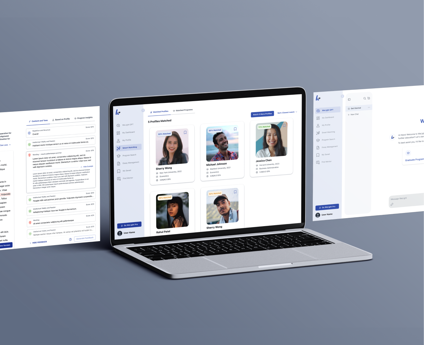
WeLight
Startup MVP Design | Education
Empowering Students through AI to Navigate Higher Education Applications with Confidence


